But I just can't find much to love about the bathrooms. They're small, they have carpet, and the tiled walls and colored fixtures make it difficult to easily change the look of the rooms. Here's some before shots of the hall bathroom. (Warning: they're terrible pictures, taken way before the blog.)

Pretty sweet wallpaper, right??
But, as per usual, I sought to identify what I LIKED about the room and build upon that. Well.....I like the pendant lights that are hung at two different heights (the pictures don't really show that, but one is higher than the other). I like that I can turn on a heating vent with a switch on the wall (wonderful for cold mornings!). And I like the large, distressed-looking mirror. And I like.......well, that's about it.
Well, the mirror felt sort of coastal to me, and so many of the colors in our house are very dark and pigmented, so I decided I wanted a light room that just felt...fresh. I decided to paint the walls a pale blue, add in plenty of white, and just create a room that felt clean and spa-like.
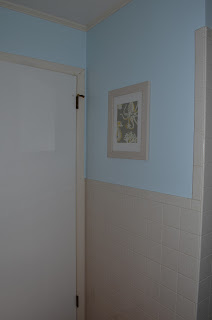
So I chose what I thought was a very light blue. It seemed light to me (remember, I tend to gravitate toward darker, more dramatic colors), but when I got it on the walls, I ended up with......this.
So I chose what I thought was a very light blue. It seemed light to me (remember, I tend to gravitate toward darker, more dramatic colors), but when I got it on the walls, I ended up with......this.
I knew from the first brush stroke that it was bad. But I convinced myself to keep going and thought that maybe if I just painted the whole room, that it would suddenly not be so bright. Wrong. So wrong. I felt like I was Under the Sea.
So the next day (literally the next day, I couldn't stand it any longer), I brought the paint cards home again and chose a blue that was almost next to white. And painted the bathroom for the second time in two days. Yup, if you're keeping count, that is the second time that I have had to paint a room twice because the first color I chose sucked. Awesome. But the second color was much better....
We changed out the window shade for one made of a natural material, and swapped the old drawer pulls and handles with brushed nickel hardware. Though I wanted the bathroom to have a fresh, coastal feel, I did NOT want it to be theme-y. I chose my accessories very carefully, selecting a lot of natural materials and avoiding anything beachy. The only exception that I made was the artwork, where I just framed scraps of fabric that I found in the clearance bin at Joann's Fabric. It is gray and white with touches of yellow, and had various sea creatures on it. It was just too fun to pass up, and since it was yellow and only small parts of the pattern peek through the windows of the pictures frames, I thought it wasn't too beachy. Does that make sense? It did to me!
This tray holds hand towels and a bowl where I stash my jewelry while I wash my face, shower, paint stuff, etc. It's one of my favorite moments in the room, because it is functional and pretty. And I never have to worry about where my wedding rings are. If I'm not wearing them, I know they are in the bowl!
The shower curtain is mostly white, with tan threads running through it. There are tiny sequins scattered through the threads, giving it just a little sparkle. It's from Homegoods, and the pictures don't do it justice. It's gorgeous! I kind of want to hunt down a spare, just in case something happens to this one!
As usual, I have a wish-list for this room. In a dream world, I'd love to tear it all out and replace everything. But that's not realistic right now, so here's the list of things that I want to do that actually might happen in the near future:
To Do List
-Replace carpeting with tile (ASAP).
-Repaint trim
- Paint vanity (black???)
- Swap out toilet and sink for non-blue options
-Swap the hinges on the door and drawers for brushed nickel options
-Swap out light switches for ones that aren't yellowed (finding one to incorporate that heating switch has been problematic).
Oh yeah, and then there was that time that a candle that I left burning in the bathroom burned dark black soot for about an hour before I noticed and left me this on the ceiling. Which wouldn't wipe off. So I had to paint the ceiling too. One more tally in the re-painting column!
But it was worth it to get the bathroom back to good.
So that's where we are at!! What rooms in your home do you find to be challenging?
Linking Up At


Looks great! I am so glad that top part was just wallpaper and not tile. Looks MUCH better post paper peel!
ReplyDeleteThanks! I think I would have died if the whole room was tiled. The wallpaper was crazy!
DeleteYou picked a beautiful blue! I love the little accessories everywhere. I think a black vanity would look AMAZING! :-)
ReplyDeleteLovely color, my fav. This is fantastic! Please SHARE this cool post at my linky party if you haven’t already, hope you stop by every week and please add as many as you would like! I really appreciate your support and encouragement .
ReplyDeletehttp://sweethaute.blogspot.com/2013/09/thursday-sweet-haute-share.html
Be Sweet~
Christina at
SWEET HAUTE
Ooh great updates! I love the color you ended up with...it was worth two tries! ;) Thank you so much for linking up at "Get Your DIY On"! I hope to see you Sunday with your fall wreath! Have a wonderful weekend!
ReplyDelete~Abby =)