But we have made a few cosmetic changes, so it's fitting to do an 'in process' post. Here are some before pics. Notice the floral wallpaper, brass hardware on the built ins, and awesome vertical blinds.
Once again, we removed wallpaper....
...and painted the walls chocolate brown. I love how it makes the white trim and white dressers pop. For now, we have left the carpeting. It is just so plush that I can't bear to tear it out just yet. Eventually, we will probably replace it with cream colored carpet. I love wood floors, but I prefer some carpeting in the bedroom, it just feels more cozy.
I'm trying to decide on which of these two walls to do an ikat stencil. I'm worried that the wall behind the bed might be too much pattern, but I think stenciling on the small wall with the doors might be complicated because I will have to cut the stencil to do the smaller areas.
The ceiling fan suddenly stopped working a few weeks ago. Part of me was THRILLED to be able to replace it (I think ceiling fans are ugly), but another part of me really misses the breeze at night. So I did some hunting and found what I think may be a suitable solution in this Allen + Roth fan.
A ceiling fan that doesn't look like a ceiling fan?! Best of both worlds, I have to have it. The problem is, it's $400 (gasp!). And Mr. M. doesn't share my hatred of ceiling fans, so he thinks its unnecessary. The simple solution would be to find a cheaper version of a ceiling fan that doesn't appear to be a ceiling fan, but I'm here to tell you that they don't exist. The ONLY other one I could find is here, and I don't like it for this room. I'm not sure what the outcome will be on this one. In the meantime, you can buy this beauty for yourself here.
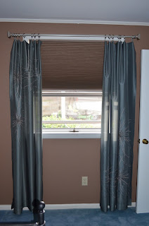
I really can't tell you exactly how much money we saved by purchasing and hanging the shades ourselves, but I'm pretty sure that it was significant. We spent somewhere in the ballpark of $150 for both shades, which I thought was extremely reasonable for custom window treatments. As for installation? It looked confusing to me, but Mr. M. didn't seem to have any trouble. Just another perk of having a handy husband :)
Also, the curtains are from JC Penny, but are no longer available. They were one of those items that I bought as inspiration and stored long before the room came together. I hung one of the panels upside down, in order to stagger the designs.
We also swapped the brass knobs on the built-ins for these interesting pebble-shaped knobs. A small change, but I really love them! Buy them here.
I shouldn't have used the flash, but it's not very sunny here today.
The white dresser and bedside table were handed down from my grandparents (Castoff Chic!), and the black bedside table was a find at Marshall's years ago. I kind of like how Mr. M.'s table is darker and more masculine. I think it makes the room more interesting.
Sorry, I moved the picture frame around while I was taking pics. It has landed on the black side table.
Master Bedroom To-Do List
- Get a working ceiling fan (you know which one I'm pulling for!)
- Find some art! Those walls are bare.
-Replace carpet (eventually, and in no rush)
-Replace old TV with a wall mounted version (I'm sort of waiting for the TV to die first. There's nothing wrong with it, other than it takes up space.)
- Style the area that currently holds the TV
-Replace lamps with something more substantial and move current lamps to the would-be-nursery
- Stencil a wall
Which is where you guys come in! Which wall do you think I should stencil? The big one behind the bed? Or the smaller wall, which has the doors to the hallway and the bathroom on it? Whichever wall I choose, I'll be leaving the background brown and stenciling a lighter color over top. Which leads to another decision...should I stencil using off-white paint or a metallic silver? Leave your opinions on the comments below!
I'm excited to get some input, so thanks in advance for your suggestions :)


Everything looks great! I would use an off-white for the stencil :) I can't wait to see the results- maybe it will give me the courage to do my own!!
ReplyDeleteSide note- I love your built-ins! So much storage! I think they would look awesome painted an off-white too. Have you ever thought of painting them? It might be a lot of work but it would brighten the room so much!
DeleteI would love to paint them! I agree, it would brighten the room SO much. My husband is a little hesitant, and we have other projects to tackle so I haven't pushed for it much. Yet :)
DeleteI love the built in's and Pops of blue! So pretty and fresh!
ReplyDeleteP.S..thank you so so much for the comment about our honeymoon! Yours sounds like it was absolutely incredible. I'd love to connect more through email...but you're a "no-reply blogger" (you probably had no idea, I didn't before someone told me!) if you go into your settings and uncheck that and add your email address, we'll be able to connect! I hope that helps.
xoxo Kylie