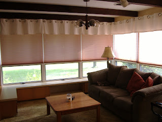
The family room scared me because it had an odd layout, with so many built-in cabinets I wasn't sure how our furniture could be arranged. It had two different types of carpet, in fact it had two different types of ceiling! The built in cabinets were topped with glass-front display cases, bringing back memories of middle school science class. It even had one of those old accordion doors separating it from the room next door, that was to become our dining room. You know, the kind that were used in older schools to separate two adjoining classrooms or halves of the gym? Basically, the whole house was bringing back memories of middle school. No wonder I was so scared.
Here are some 'before' pictures to help you understand my concerns. I wish I had taken more angles, so that I could show you the accordion door, because then you might truly understand!
That's not to say that this room didn't have any redeeming qualities. As you can see above, one whole wall is made of stone and has a window that connects the family room to our kitchen. It used to be an exterior wall, but when the couple that built the home enclosed their patio, it became a part of the family room. Plus, look at all of those windows! And there's this cool lighting fixture they installed. It's so unique. I love it!
My husband had the idea to knock out the divider between the middle two display cases, and to remove the shelves in order to create a space to house our TV. He did such a great job, and the finished product looks like a built-in entertainment center. The cabinets below house our DVR, DVD collection, and much more!
We also painted the walls red (yes, the same color red that we painted the front door and yes, I do use other colors in our home). The paint is by True Value and the color is called Sanguine. I love how saturated the color is, without being too in your face. Definite progress.
(Notice the little photo-bomber with the glowing eyes in the bottom picture. That's Bron, one of our cats.)
But the real changes started happening when we ripped out the carpet in most of the house and replaced it with laminate wood flooring. We used Pergo (I believe the color was Red Jatoba, but it has now been discontinued), and Mr. M. installed it himself over several weekends. I didn't have much to do with it other than try to play DJ and dance around the house while he worked in my own private 'the ugly carpet is gone' celebration. Ah, I can hear 'This is How We Do It' playing in my mind now....
Add in some new chunky jute area rugs, trying my hand with pattern-mixing in my throw pillows, and the addition of a chair/ottoman, and that pretty much brings us up to where we are today.
I still have a lot of ideas for this room. The mauve blinds that came with the house could stand to be replaced. I've always thought the built in shelves around the windows could be a cool upholstered bench, the off-white curtains could stand to have a little more flavor, and I'd love to find some fun lampshades to flank the couch. But I've come a long way from crying about this room. And as for the two different ceilings, now that the room is filled with things that I love, I hardly notice them anymore!
What room transformations have you done to your home? I'd love to hear about them!
Linking up at


Our biggest transformation would have to be our guest room. It was a teenager's room with bright blue walls. Now the walls are dark grey, the baseboards/windows/doors are white, the furniture is black (we painted old stuff we had), pictures on the walls are all black and white, and the color accent is a deep red! It's a really small room but now it is at least stylish. We never even have guests, though. It is pretty much just my changing room!
ReplyDeleteOoh, it sounds fun! I'll have to check it out next time I'm at your house!
Delete