
Thanks so much for all of your kind comments and words of encouragement on yesterday's post. It meant the world to me.
So I've been talking about transitioning our family room to a more spring-like color palette for weeks now, and while I'm not ready to call it done yet, I am ready to share another piece of Project Family Room with you!
You may remember that almost all of the walls in our family room are either windows or stone, which leave very little wall space for artwork. The one piece of art that we do have just doesn't fit with the cooler accents that I'm trying to bring in for Spring and Summer, so I decided to DIY something new to fit the frame. I didn't want to ruin the print, since I might want to use it again, so I just removed the cardboard backing that was keeping the artwork in the frame and stored the print in our attic for now.
Confession: I'm not really feeling the red in here anymore. I'm not sure what color I wish the walls were, but I have a feeling that the red may fall victim to a repainting mission that I'm pretty sure I'll feel compelled to complete during my upcoming 2 months of summer vaca. Or maybe its just finally time to replace the window shades (which came with the house and we never got around to replacing because those things cause a fortune). If I do paint, Mr. M. is going to want to kill me....he's not amused by my decorating ADD.

The closest thing I have to a 'before' pic.
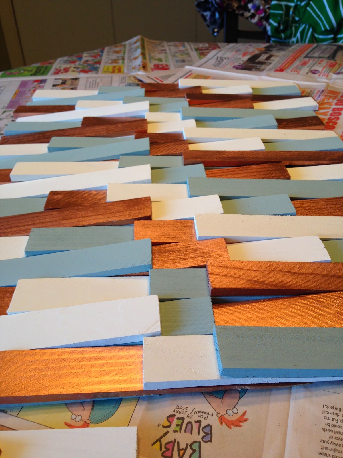
So, back to the art project. I've seen some cool art being created using wood shims lately, and decided to create my own. Most of the wood shim art that I have seen has used a herringbone pattern, but since I had just done that in my DIY Herringbone Art for the bathroom, I decided to lay my wood shims a little differently.
But first, I had to paint my wood shims, which I picked up at the hardware store for about 12 bucks. Since I'm trying to bring some blue into the family room, I decided to use the same Country Chic paint that I used on my Upcycled Succulent Planter. For a metallic accent, I decided to stray a little from my love affair with gold (don't tell), and go for some Rustoleum copper spray paint. And to keep things light and bright, I painted 1/3 of my wood shims white. Since I had all the paint that I needed on-hand, all that I had to buy for this project were the wood shims.

Deciding how to lay my wood shims gave me some trouble. I really toyed around with the idea of laying the shims randomly, at irregular intervals and without a using a color pattern. But in the end, I was afraid that my randomness would read as messiness, and that I'd end up tearing the whole thing apart. So I decided to create a more measured, regular design.
After measuring the frame, I used my questionable math skills to figure out that I could fit four shims in each row, if I laid a new shim every 5 and 3/8th inches and that 18 rows would fit perfectly into the frame. I also knew that I wanted to lay each row in alternating directions, in order to create some texture.
To get started, I laid out my rows of shims in the color pattern in which I planned to glue them. Once I was sure that I liked the way it looked, I cut a template shim exactly 5 and 3/8 inches long, and used it to guide me as I wood-glued each row of shims to each other, each 5 and 3/8 inches apart.
As you can see, the shims are not yet evenly spaced in this pic.
After waiting several hours for the glue to dry, I stacked each of the 18 rows behind the glass of the frame...only all 18 rows didn't quite fit. Which is when I realized that my math worked in theory, but because wood shims are not perfectly identical to each other, nor are they perfectly square, that my rows had not stacked as perfectly as I had expected them to....
...Leaving me with the dilemma that 17 rows left me with a gap at the top of my picture frame, while 18 rows just wouldn't fit into the frame.
So, I used my Mr. M.'s Dremmel Multi-Pro (I love how I'm calling the tools mine now, as if I don't need his assistance pretty much every time I use one) to sand down the width of the 18th row by half an inch or so, and positioned the unfinished edge under the frame, so that it would not be visible from the front....

...and then I just put the original cardboard backing back in place, duct taped it to the back of the frame (why not?!) and hung that baby up on the wall.
It's a little hard to photograph due to the windows directly opposite the wall on which it hangs and the reflective surface of the glass. I considered leaving the glass out of the frame, but I'm concerned that the shims may not stay in place without the glass there to hold them.
Plus, how would I dust all of those nooks and crannies??
I like how it's bringing some more of the robin's egg blue into the room. Compared to the oranges, reds and golds in the previous piece of art, it's feeling much more seasonally appropriate.
I'm kind of considering trying out some brick hanging clips to see if I could hang it on the wall to the right of the window into the kitchen, which would free up this wall space once again.
Mini gallery wall, perhaps??

We'll see! For now, it's staying right where it is!
What color would you paint this room?? With all of the windows and stonework, there's not a lot of wall space. The adjoining room is gray, but it too is set for a repainting (the gray has much more blue in it than I initially realized).
Linking Up At

Sherwin Williams Balanced Beige! It would work great with your hardwood floors, your sofas, chair and those beams! Love them! Also it would connect with your stone wall and pull out some of the darker tones. Or.... SW Mega Greige would work great also, if you wanted to go a more grey route! Good luck!
ReplyDeleteOooh, thanks for the suggestions!
Delete