Thursday, October 31, 2013

Guest Post {The Vanity Room}

Hey hey! I've been a bit under the weather for the last few days, so when Amber from The Vanity Room approached me about writing a guest post, the timing couldn't be any more perfect.  Like me, Amber is a fairly new blogger, who has a passion for home decor and expressing her creativity in her home.  She writes over at The Vanity Room, and is sharing her take on bathrooms with us today.....


Themed Bathrooms

Themed bathrooms used to be very big in the Seventies. Modern bathrooms tend to be much plainer, almost boring, and if they are themed, there tends to be an underwater or marine theme – lots of blue and white, stencils or tiles featuring fish, starfish and octopi and even the occasional mermaid. However, there is so much more that can be done in a bathroom to make 'going' an event, an entry into another realm!

Princess Bathroom

Make your little girl feel wonderful in her very own princess bathroom. For a quirky, fun note in this royal bathroom, paint the toilet with gold paint and add delicate filigree touches so she can…er… sit on the throne while she does her business!


Underwater Bathroom

If you are going to follow the intuitive underwater theme that bathrooms invite, why not add a unique spin on it by allowing pop culture to inspire you? This bathroom is instantly recognizable thanks to the bath being painted to emulate the yellow submarine of the Beatles' fame! Vibrant and colorful fish live in and around exquisite coral reefs and starfish, sea cucumbers and sea snails invite wonder. With so much marine splendor to choose from do not limit yourself to blue on white tiles or paint, and make sure you create a bathroom so wonderfully watery that you hold your breath whenever you go in! You can buy marine themed bathroom accessories from Cafe press. Go for their marine life bathroom curtains you will actually feel as if you are bathing among the fish!


Egyptian Bathroom

Create a bathroom fit for a pharaoh! Dull gold paint or wallpaper, glittering accessories and taps and fabulous ancient Egyptian themed decorations all combine to create the perfect old world atmosphere. Perhaps the magic of the pyramid will work and keep all the razors in the room perfectly sharpened? Even if it does not work physical marvels, guests and families alike will be charmed and delighted by this short visit into an old, yet rich and wondrous world.


Game Bathroom

Let your creativity go wild and redo your bathroom as a scene from your favorite game. Pacman can chase the ghosts around your walls, or Mario and Luigi can bounce from basin to loo in pursuit of Bowser and co! A game themed bathroom will work well for all ages, especially as the first wave of computer geeks hit their fifties!


Your bathroom can be your oyster, to mangle a paraphrase! Allow your imagination free rein and think over the possibilities available to you for your bathroom. You could paint a forest on the walls for a 'back to nature' bathroom, spread the Zodiac over the four walls if you are an astrology buff or even bedeck the walls with dragons and unicorns to create a mythical land inside your home's smallest room or use unique tiles to redo your old boring bathroom floor. My-bathrooms.co.uk provides a great range of bathroom tiles. I recently ordered a few samples from there and if you don’t like the sample they can even refund your payment. Isn’t that great? Fortunately I liked the sample so ordered them for my Spa themed bathroom. 


Thanks Amber!  That mosaic tile in the submarine bathroom was crazy-detailed, and I just loved that rustic door with the port hole!

Be sure to check out Amber over at The Vanity Room and give her some blog-love!

 photo signature_zps64b784cd.jpg

Tuesday, October 29, 2013

Haute Antlers

Last weekend, I went "shopping" in my parent's basement. Say what?  Most of you don't know my parents, but those of you that do know that the basement is my dad's (and the dog's) domain.  It's filled with wildlife prints, a bar and beer fridge, and yes, antlers.  

Which is exactly what I was there for.  Antlers are hot right now, and lucky for me, my dad has a ton of them that he was willing to donate to the cause.

My selection.  And this is just what he had in the house!  He said that he could bring more from his hunting camp.  Um...yes, please!

Why did I want antlers, you ask?  Duh, so I could spray paint them!  Have you not caught on yet?!  Antlers are cool.  They're sculptural, you can paint them any color you like, or just leave them natural.  I can think of a million places that I could use them. And mine turned out pretty fab, if I do say so myself!


This project was about as easy as it gets.  I spray painted the whole thing off-white and allowed that to dry.  Then I went back and taped off the tips, covered the rest in a grocery store bag and spray painted gold.  I painted the skull part (Ew, that sounds so gross! It really wasn't.  I mean these antlers were dated 1984, which is almost as old as I am.  It's not like there was anything gross left) by hand with Martha Stewart's liquid gold leaf craft paint, since it was too difficult to tape off. 

Side note: This was the first time I used the Martha paint.  It was amazing.  I'm actively resisting the urge to paint everything in sight. 

It makes a nice little addition to our family room bookshelves, don't you think?


And a wide shot, so you can see the entertainment center area.  I like how they stand out on the red walls. 


Never one to quit while I'm ahead, I decided that my first set of antlers worked out so well that I would paint one more for the living room.  This room has a much cooler color palette, of dark purple and gray, with turquoise accents.  

So this time, I decided to paint my antler turquoise, and use silver spray paint in the tips.  I added a stripe of black craft paint to define the line between turquoise and silver.  

Another home run in my book!  However I had some trouble deciding where the antler should live for the time being.  

I tried it on a little accent table.....It looked great!


And then in one of the speaker stands that flank our TV stand....also looked good in there!  I imagine layering some other objects behind it, if that were to be its final resting place.  


And finally, I tried it as part of my coffee table vignette....also fabulous!


It looks great everywhere!  What's a girl to do...

I'll probably make another one :)

Linking Up At

 photo signature_zps64b784cd.jpg

Monday, October 28, 2013

Mantle-less = Mantle-lust

I've mentioned this before, but as the Christmas season approaches, I find my longing for a mantle above our fireplace growing by the minute.  I'm dreaming up holiday mantle-scapes, online window-shopping for accessories, and stalking fellow-bloggers' mantles almost daily.  It's bordering on full-blown obsession at this point.

Here's a look at our fireplace as it stands now.  In addition to a mantle, I have some dreams for the hearth area and fireplace insert.  But one project at a time...


I have an entire Pinterest board dedicated to my mantle-lust. I envision an unfinished barn beam floating on the stone, glamm-ed up with a contemporary mirror and some shiny accents. For some reason, I think mixing the materials would be cool.  I even have a lead on a potential source for a beam.

So in honor of this recent obsession, here's some of my Pinspiration.  No one seems to share my desire to glam up their rustic mantles with fabulous accents, but that's OK. I'm willing to be the visionary on this one...


I love how the barn beam seems to float in the middle of the wall.


This beam has the rustic feel that I want. I'd like our beam to look sort of unfinished.


Another nice, rustic beam.


And I REALLY love this one. I know that it's not a barn beam...but there's something about it. It sort of makes me question whether maybe perhaps I should go for something more finished, like this.

I'm so indecisive!!  Which option do you like?  You can check out the rest of our dining room here, for reference. photo signature_zps64b784cd.jpg

Friday, October 25, 2013

Friday Favs 14

Happy Friday!  I'm SO excited for the weekend!  For this week's Friday Favs, I thought I'd give you a rundown of five of my very favorite home decor blogs......if I can manage to narrow it down to just five.

A tough task, but eventually I did manage to do it.  After about an hour of deliberating.

What do I look for in a blogger, you ask?  Basically someone with cool style, whose writing makes me feel like we could be friends.  Seriously, I wish some of these girls (and guy) lived near me.  I'd totally invite them over for coffee. Or wine :)  And hope for a return invite for a close up look at their fabulous homes!

Keep in mind that my favorites tend to rotate, but here are the ones that I find myself looking forward to reading lately!

Fav #1
Young House Love.  For me, YHL is the blog that started it all and will make my Top Five any day.  John and Sherry have fab style and break down all the details of how they give their house some major love.  They're currently working on their third house (and their second kid!), and following along with their detail-oriented, photo-loaded, pop-culture-referencing posts is the bright spot of many weekday afternoons.  They're both sweet and hilarious, and you should definitely check them out!

Young House Love

Young House Love

Fav #2
Rain on a Tin Roof. I'll start with the fact that Jenna has made witty references to both Sex and the City AND Full House in the last month, and I'll end with this gorgeous collage of her kitchen.  Those green and navy stools are just perfect, and there is so much more to read and love.  Be sure to check her out!

Rain on a Tin Roof


Fav #3
Bliss at Home.  Kristin has a project gallery like none other.  One could easily spend a few hours browsing her gorgeous DIY decor projects, and her house tour is filled with interesting, beautiful images and lovely, lovely inspiration.  And antlers.  Lots of antlers....and I love them!
Bliss At Home


Bliss at Home

Fav #4
Hi Sugarplum!  You have to check out Cassie's blog.  She mixes the most unexpected items (like the awesome elephant planter below!!) to create unique and interesting spaces.  Plus she's hilarious, real, and down-to-earth.  I think you'll love her blog, so be sure to stop over and give her some love!

Hi Sugarplum!


Hi Sugarplum!

Fav #5 
House by Hoff. April's style is amazing. I love how she uses color and pattern to create an interesting, layered home.  Check out these cool pallet-mounted plates she has hung over her striped curtains!  I love them and and the rest of her house tour.  Stop by and visit her blog this weekend, I think you'll love it too!

House by Hoff


So now you have enough reading material to last you all weekend!!  Enjoy :)

 photo signature_zps64b784cd.jpg

Tuesday, October 22, 2013

Keeping it Real: How I Ruined (and Restored) a Lampshade


Unfortunately, not all of my little projects turn out to be masterpieces the first time.  Or even the fourth time. And I think its only fair to show my failures along with my success.

Cause I'm keeping it real!

And since none of you got my little 'keeping it real' reference the last time I made it (you really disappoint me, people!).....


 So anyway, there are plenty of times that my little 'tranformations' go a little south.  Case in point, the butt-ugly lampshade on our floor lamp in the living room.

So why would I buy a lamp with a lampshade that I'd describe as butt-ugly in the first place? Because the lamp base is awesome and it was on clearance at Pier 1.  Obviously.

I just don't know what they were thinking with that shade on this lamp.


When I bought the lamp, I told myself that I would simply buy another lamp shade.  Wrong.  You probably can't tell in the picture, but this lamp shade is huge.  Finding another drum lampshade in a similar size, style I liked, at a price I was willing to pay turned out to be impossible.  Believe me, I looked.  For like a year and a half.


In fact, lampshades have sort of been my nemesis lately.  I have two lamp bases that bought without shades and flipped over the summer that I have also been unable to find suitable shades for.  I guess I should have learned my lesson with this shiny silver, feathered beauty.  

Nope.  I rarely learn lessons the first time around.  

Anyway, I saw some blogger inspiration of painted lampshades and decided that I should give it a shot.  The lampshade is made of non-porous, thick, paper-like material, so painting it seemed like a good option.  I decided to spray-paint it a new base color and attempt to free-hand a chevron pattern.  I was kind of going for an imperfect look, so free-handing it seemed to be a good idea.

Spray painting the shade was easy enough. The color felt too bright to me, but I anticipated the silver chevron toning that down a little bit.....


....which it did.  I achieved this look by dipping the top of a pointed, foam craft brush in silver paint and dotting it along the shade in a chevron pattern.

While not perfect, this turned out OK. Plus, I had kind of been shooting for imperfect.


So, I should have stopped here.  But no...


....after a few days, the imperfections in pattern just seemed to be glaring at me.  They were all I could see. So I decided to thicken up the chevron stripes, thinking that would somehow make the imperfections less glaring.  

So I used Silver Leaf Rub N' Buff and my finger to color in alternating chevrons.  Big mistake.  Big.  Huge. (can someone PLEASE get this movie reference?!).

It looked like a kindergartner finger-painted it.  No lie.

And, crappy blogger that I am, I forgot to photograph it!!  I think I was so grossed out by it and in such a hurry to get rid of the atrocity that I jumped into changing it without thinking to take pics.  Sorry :(

At that point I decided to cover it with fabric.  I spent a few weeks looking for fabric that woudl be thick enough in a color or print that I liked.  As luck would have it, I found a brand-new Threshold white cotton tab-top curtain for $3 at my local Goodwill.  The fabric was nice and thick, and there was no way that I could have bought that much fabric for less than $3.

So I cut a length of fabric that was two inches wider than my shade (one inch overlap on both the top and the bottom), and wrapped it around my lampshade.  I hot glued the top and the bottom to the inside of the shade, just inside the rim.


And once I got to the end of my fabric I folded about an inch of it over on itself and hot glued it in order to create a 'finished' end.  


This helped create a more finished looking seam.  Which of course I hid at the back of the shade, against the wall!


I'm pretty pleased with the result!  It seems to bring more of a light feeling into the room. 
Notice that Giselle has joined the gallery wall!


Now if only I hadn't taken me two failed projects to get there...

Sigh.  At least I'm keeping the hardware stores in business :)


Linking Up At
Sweet Haute
Give Me the Goods Monday
Wow Me Wednesday
Inspire Me Please Weekend Blog Hop


Monday, October 21, 2013

Parade of Homes Recap: 5 of 5

Good morning!  Let's get another week rolling with the fifth (and final) house tour from the 2013 Parade of Homes!  To be honest, I'm both happy and sad to see the end of this series for the year. Happy because these posts took FOREVER to write (the 40-50 pictures per post seemed to take a lifetime to load), but sad because I've really enjoyed re-living all of the house tours and writing about what I liked about each of the homes.  

Don't worry.  By next fall, I'll be ready to tour a new crop of houses and will have forgotten about the 90 minutes that it takes to load each post's pictures. (Blogger friends---is this normal??!)

Ok.  So onward to the fifth house-- I really liked this one!

Just like the house before it, House #5 was also in the Amber Fields community.  However, this house was built by Garman Builders.  This house won many of the Parade of Homes Awards, and it was easy to see why.  This home has 2,776 square feet, four bedrooms and two and a half baths, as well as a three-car garage.

As you can see, the exterior of the home was very traditional and quite stately.  It kind of reminded me of the house from Home Alone (a good thing, in my mind)! I'm not sure that we can be friends anymore if you don't know what I'm talking about, but just in case some of you have never seen Home Alone, here is a comparison:

The fifth house I toured.

The house from Home Alone


Upon entry through the front door, I arrived in a two-story foyer, and I knew immediately that I was going to like this home. It was furnished, for one thing, and while the decor was much more traditional than I would select for myself, it was lovely.  Another thing that I noticed immediately were the iron balusters, which suggested that the builder had paid attention to details and built an interesting and special home.  


How right that was. This home had many lovely details, like a sitting area located at the top of the stairs!  To the right of the foyer was a powder room that was perfectly located for guests, and a study.  To the right was the formal dining room.

In fact, here's a look at the first story floor plan:

PA Parade of Homes


The powder room was painted a rich, deep red, which was brightened up with white wainscoting.


 I particularly liked the built-in shelves, and thought that they would be fun to style.


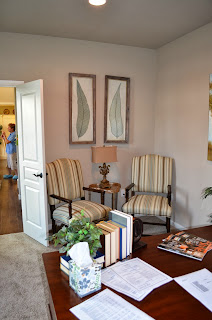
Once again, the study in this home felt rather masculine.  I would have liked to see the gorgeous hardwood floors flow into this room, and an area rug to liven up the decor.  
 But there's no doubt that this room would be a wonderful office.  Ahh...to have my very own home office. Perhaps I should add that to my ever-growing 'wish list' items for my dream home?

I really liked the nail-head trimmed end table, and thought that the cool curtain rods illustrated once again how well the builder and decorator paid attention to details and making this house much more special than a builder-basic model home.

The dining room was my favorite place in the house.  Those coffered ceilings had me at hello.  In fact, I feel like I can't go another day without having those in my house.  I wonder if they can be added? (Making mental note to ask Mr. M. about this.)


The kitchen could be accessed through the foyer or through a doorway at the back of the dining room.  It was open to a spacious eat-in area. 


The kitchen was pretty traditional with granite counter tops and bright white cabinetry.  I would have liked to see the cabinets extent to the ceiling, and a backslash that offered more contrast to the white cabinets.  I liked that the island was a different color than the cabinets.  

In the center of the above picture, you can see a doorway that leads to an area termed the 'drop zone', which consisted of a mud-room-type area and a large walk-in pantry.


See the attention to detail on this doorway?! It was touches like this that made the home feel custom.


And here is a view from the 'drop zone', through the kitchen and eat-in area into the family room.  Once again, I think the space may have felt larger and more flowing had they chosen to continue the hardwood floors into the family room.  But that was a complaint that I had in every single home that I saw, so maybe I'm in the minority here?

The living room was gorgeous.  I loved the paint color on the accent wall and many of the fabric choices.  Like those ikat accent chairs!


I thought the wood on this coffee table was beautiful.
I also loved this end table!


Then it was time to go upstairs.  Here is the second story floor plan:

PA Parade of Homes


I was greeted at the top of the stairs by the laundry room and this cute sitting area.


At the top of the stairs, the left side of the house was dedicated to the three secondary bedrooms and the full bathroom intended for them to share.  These secondary bedrooms were not painted or furnished, so there isn't much to show, but each one of them had its own walk-in closet.  Here's a shot of one of the bedrooms, which was a little different from the others in that it had a peaked ceiling.  If you didn't need to use it as a bedroom, this would also be a nice media room or craft room.   


Here's the hall bathroom.


And then the entire right wing of the upstairs was dedicated to the master suite. It was really nice and spacious!


 See?  Look at all of that room!  Additionally, the master had tray ceilings and a large walk-in closet.  I'd love to have a sitting area like that in our bedroom. 


I particularly liked the bench at the foot of the bed, probably because of the nail head trim.  The wine didn't hurt either!


Then it was on to the master bathroom.  While it wasn't as huge as some of the others I saw on the tour, it was certainly spacious, with a walk-in shower, spa tub and double sinks.  


I liked the dark cabinetry and the oil-rubbed bronze trim on the shower, which were something a little different than the other bathrooms I saw.  


And that was it!  My favorite part of this one was definitely the coffered ceiling in the dining room.  I'd love to have on of those...maybe paint the ceiling between the beams rather than the walls in that room?  That would be fun. 

So you've seen all of the houses now. Which was your favorite?  
 photo signature_zps64b784cd.jpg