Hey! Time for house recap #2 from my recent tour of the 2013 Parade of Homes. This second home was completely unfurnished (boo), but did have some cool features that I'm excited to share!
This home was built by McNaughton Homes and is located in a community called Autumn Oaks. It has 2,700 square feet, four bedrooms, two and a half baths, and a two car garage. As you can see, the exterior was very traditional, with beige siding and a small amount of stone veneer.
Here's the first floor floor-plan:
Walking through the front door brought me into a two story foyer with a fun lighting fixture. I'm a sucker for things that make a home different and interesting, so I really liked the light.
 |
| Image via PA Parade of Homes |
Walking through the front door brought me into a two story foyer with a fun lighting fixture. I'm a sucker for things that make a home different and interesting, so I really liked the light.
Immediately to the left of the foyer was a dining room with gorgeous hardwood floors and a fantastic tray ceiling. Oh how I love a tray ceiling! I would have loved to see this room furnished. Between the floors, the pale green paint color, and that ceiling, it could have been amazing. I'm sure it will be once whoever buys it moves in.
The dining room connected to a small butler's pantry, which followed straight through into the kitchen. Butler's pantries were common in many of the homes I toured, and this one was nicely equipped with a wine rack, sink, wine refrigerator, pantry area and espresso cabinetry.
Wouldn't it be lovely to have an area such as this to store serving pieces and other things we don't use everyday?!
The beautiful hardwood floors carried through to the spacious kitchen, which featured whitecabinetry, granite counter tops, and pendant lights that I really loved (they had a slightly industrial feel up close).

The kitchen also featured a chalkboard wall! I thought it was cool that the builders incorporated this trend, and appreciated the casual feel it brought to the kitchen.
Opposite from the kitchen was a nicely sized family room, with large windows and a fireplace. Once again, I liked the color of this room and would have loved to see it furnished!
To the right of the foyer lay the staircase, followed by a mudroom that connected to the garage and then a small powder room. Mudrooms were also a big trend in the homes I toured, and most of them featured these locker-like areas with hooks and shelves for shoe/coat/bag storage, as well as a place to sit to put on boots and shoes.

Given the choice between a butler's pantry and a mudroom, I'd choose the mudroom every time (although I'd certainly prefer both). They're just so functional!
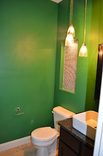
While I'm not a fan of the emerald green color choice in this mudroom, or in the powder room beyond, I do like the idea of a bold color in these spaces. Just not this color. I know emerald was Color of the Year, but it's just not doing it for me. Maybe in a smaller dose?

But we all know that paint is easy to change, and the powder room had plenty of other redeeming qualities. Check out the cool cluster of pendant lights, the vessel sink, and that interesting tiled-display area. That would be fun to accessorize!
Then, I headed upstairs. Here's the second story floor-plan:
 |
| Image via PA Parade of Homes |
The upstairs was much more neutral. In addition to the master suite, there were three carpeted bedrooms, each with large windows and a nicely sized closet (two of them walk-in, one of them not).
 |
| I took pictures of all three, but they all pretty much looked like this. |

There was also a full hall bathroom, with a sink area that was separate from the bathtub/ toilet area.
A nice second-level laundry room sat at the top of the staircase.
The master suite featured another tray ceiling (a single layer, as opposed to the dining room's double layer), and a large walk-in closet.

The galley-style, en-suite master bath featured a soaker-tub, large walk-in shower, separate toilet area, and double vanity.
Another large walk-in closet lay at the other end of the master bath. Having two walk-ins as a part of the master suite was a really great idea, and this one could probably be termed a 'dressing room', as it much larger than any of the other walk-in closets in the house.

Having two walk-in closets in the master suite was another common thread that I noticed in the homes on the tour. Was I jealous of them? ...Yup!
I also liked the mixture of tile shapes in the walk-in-shower.


Wow, I wonder how much this house was!!?? The green looked to "kid" in the mudroom. I look at that and think, what the heck would I do with that room, it's for kids muddy stuff! But if it had been a more neutral color, I think I could have envisioned my school bag there, maybe my gym bag, and stuff like that.
ReplyDelete