Wednesday, February 12, 2014

Experimenting With Mixed Metals

Last weekend I spend some time doing one of my very favorite things-- rearranging some of my home accessories to see what fun, new combinations I could come up with.  I love to putter around the house on a free afternoon, moving things around, making the house feel fresh and new. 

Only.....I noticed that nothing I put together felt very fresh.  Or new.

For some reason, I've always stuck with one metal at a time when it comes to my decor accessories and finishes.  Silver or gold.  Usually gold with warm tones and silver with cool tones. 

Check out my house tour.  You'll totally see what I mean. Family room = red = gold.  Dining room = gray = silver. It's like I've never even considered the possibility of mixing metals or breaking out of the mold. 

Until now.


To mix things up, I decided to experiment with mixed metals in the living room. I brought many of the gold accessories from the family room and incorporated them into my living room decor.  Having new accessories at my disposal was so helpful to help me break out of my rut!  


Look at how the gold accessories seem to glow in the mostly cool-toned room!  They really stand out, and it's refreshing to see something different in a space where I've felt a bit uninspired lately.  


 I found that in order for both the gold and the silver accessories to work, I had to simplify the color scheme in the room.  I pulled out a lot of my turquoise accessories, and stuck with mostly black, white, and eggplant. This seemed to help keep things looking cohesive, rather than a random assortment of stuff thrown into a room. 


I'm not sure that I'll leave the gold accessories in here permanently.  While it feels fresh and new right now, I suspect that I'll eventually transition many of the gold accessories back into the living room....that or buy some more stuff, because this little experiment has left my bookshelves almost bare!

Either way, it's nice to know that mixing metals can work!


Do you mix metals?  What do you think of it?

I'm not sure why it took me so long to try this!!  

Linking Up At


 photo signature_zps64b784cd.jpg

Monday, February 10, 2014

February Chalkboard Art

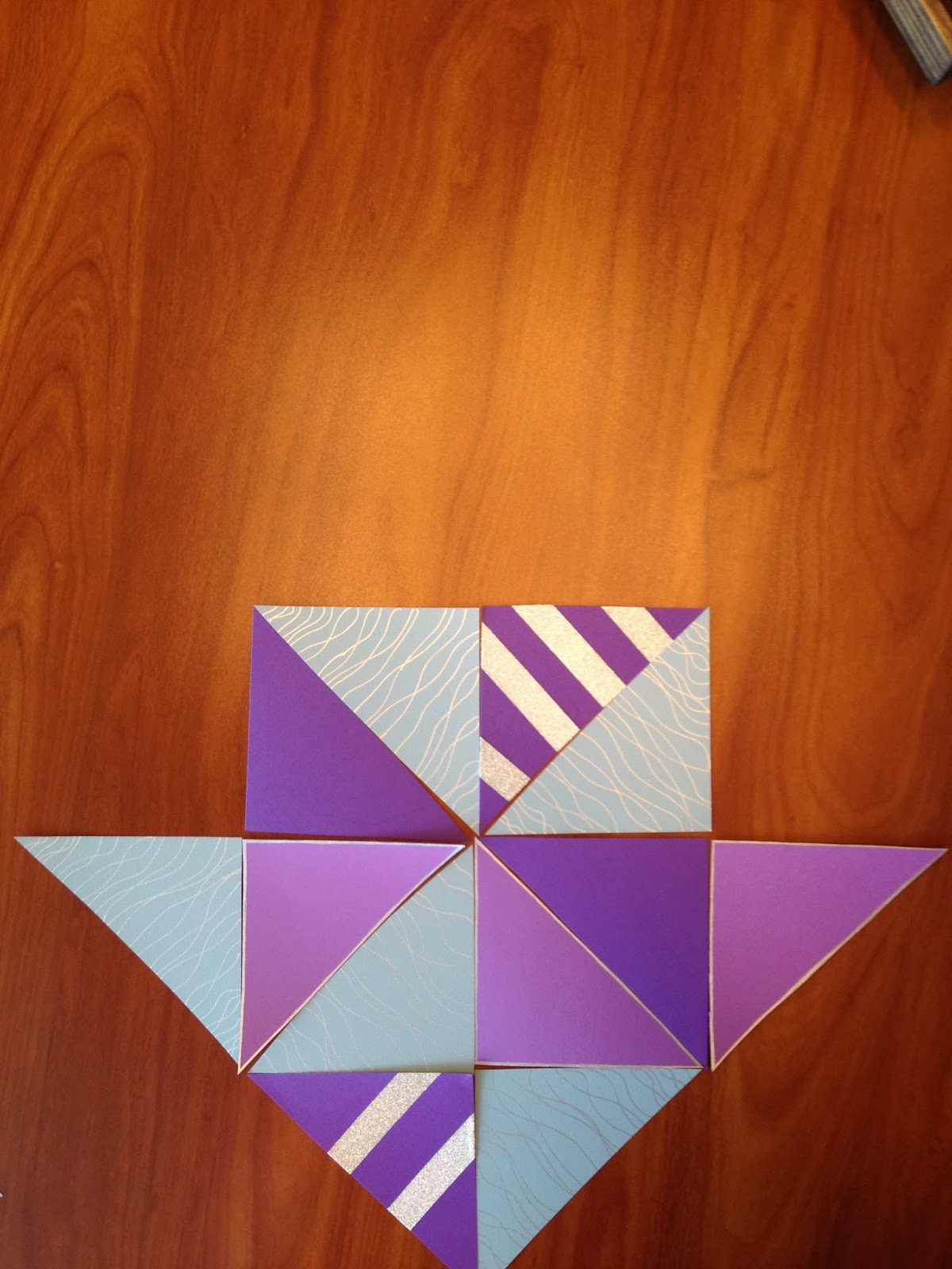
Using geometric shapes has been a huge trend in home decor over the past year or so, and for February's chalkboard art, I decided to get in on the action.  

I wanted to create a heart shape for Valentine's Day, but I knew that drawing perfect geometric lines on the chalkboard might turn into a three day affair, similar to November's chalkboard debacle.

So, I created a geometric heart using triangles created from cardstock instead.  It was incredibly easy, and I love how it turned out!


I started by cutting triangles in three different colors of cardstock. I chose aqua and two shades of purple, because I though they would be a fun combination with the red chalkboard frame.

You know I'm not afraid of color. 


To add some interest, I embellished some of the triangles with a silver paint pen and some silver washi tape.  

The aqua triangles turned out to be my favorite.


From there, creating a heart was just like assembling a puzzle.  


It took me some time to feel satisfied with the placement of all of the various triangles, but I got there eventually.  From there, all that I had to do was attach the triangles to the chalkboard using painter's tape. 

I debated adding a message with chalk, but in the end, I decided that the simple heart was  better left on its own.


What are your Valentine's Day plans?  We usually make a special dinner together and spend it at home.  I'm thinking I might bring back the Chocolate Covered Strawberry Layer Cake...

...I'm salivating just thinking about it.

Have a great week!!

Linking Up At
 photo signature_zps64b784cd.jpg

Friday, February 7, 2014

Friday Favs 29

Yay for Friday!  I'm actually not my usual desperate-for sleep self this Friday morning because school was closed half the week for snow days...


Oh, who am I kidding?  Who doesn't love Fridays and the knowledge that you can sleep in tomorrow?!  I know I do.  

Onto the best things about this week!

Fav #1
The 2014 Winter Olympics.  I LOVE the Olympics!! They are addicting, and I get so excited each time they come around. I'll admit....I've also been kind of hooked on following the #SochiProblems as well.  While I'm normally totally jealous of all the people who get to attend the games, I think I'll be content to enjoy this one from home.  Try to bear with me as I stay up way too late pretty much every night for the next two weeks!


Fav #2
Modern Masters Metal Effects paint and aging solutions.  This metallic paint is gorgeous and looks fantastic on its own, BUT topping it off with the aging solution causes the metal to react and patina, which takes it to a whole new level!  It comes in a variety of metals and aging solutions. I'm dying to try it!  Buy it here and check out Tara's gorgeous mason jars with blue patina below!  

Mason Jars with Blue Patina via Suburble

Fav #3
Breaking Bad.  Whoa.  One of the very few perks of being stuck inside all winter is having the time to use Netflix try out shows that we should have been watching while they were airing.  Breaking Bad is kind of awesome.  Worth every bit of hype.


Fav #4
Hometalk.  I've said this before, and I'm sure I'll say it again, but how did I not know this existed?! Hometalk is basically Pinterest, but specifically for home and garden info.  So it's filled with people who are passionate about their homes and are looking to share ideas, tips and advice, without all of the quotes, fitness inspiration pics, and other stuff clogging your feed. Love it!


Are you as into the Olympics as I am?  What's your fav winter sport?  I love the figure skating and speed skating... 

Have a great weekend!

 photo signature_zps64b784cd.jpg

Thursday, February 6, 2014

Valentine's Day Gold Leaf Plates


As I've said before, I don't go too crazy with holiday decorating.  Especially for non-holidays like Valentine's Day.

 BUT I went a little gold-leaf crazy while I was snowed in this week.  And while I was at it, creating some Valentine's Day art seemed like a good idea.  

Plus, I had some mismatched salad plates laying around. So I had no choice, really.

I love the chippy, imperfect finish that gold leaf produces.  Which is a perfect match for the very imperfect method that I used to create these plates.  I simply used a small paint brush dipped in adhesive to paint a design on each plate, covered the whole thing with gold leaf, and then used an old toothbrush to brush off the excess. Once that was finished, I used the toothbrush to rub off a little more of the gold leaf in order to give the plates a worn look.


I used these unexpected additions to change up my console table decor....


....which might be one of the most difficult places in the house to photograph. Shadows abound.


I think they are kind of fun!

Linking Up At

 photo signature_zps64b784cd.jpg

Wednesday, February 5, 2014

App Crack: Waterlogue

Hey guys!  Sorry for the late post today.  Since the snow/ice storm has given me yet another snow day at home, I didn't feel the need to push for my usual 7am post time.  

You're probably thinking 'App Crack?'....what is she talking about?  Basically, it describes any app that I find myself being addicted to, can't put down, am pretty much OBSESSED with.  

And it's a fun little play on words.  I'm funny like that.

All this time at home has given me plenty of time to read up on the new happenings in the Instagram-world and blog-land, and I'm super excited to share my favorite new trend with you! 

If you follow me on Instagram (do it, already!), you've already seen me hyping-up this little wonder, but for those of you who don't.....


I just discovered this new app called Waterlogue that allows you to easily turn any photo into an awesome watercolor work of art using your I-phone or I-pad (sorry Android users).  I don't often pay for apps, but this one is worth the $2.99 price tag! 


Best of all, this cool app allows you to play around with the watercolor features to help you achieve whatever look you're going for.  You can change up the intensity of color, brush strokes and other artsy things in which I'm not well-versed enough to talk about.  

Bottom line?  It. Is. Addicting. 

Here's a pic of the current state of affairs in our backyard...

and after a little Waterlogue magic...

Wouldn't it have been pretty if there was a cardinal or something bright sitting in there somewhere?

Oh well.

My favorite plant with it's twisty branches covered in snow before...


...and after.


And of course I had to play around with some of my favorite pics of the cats.  You've seen the Before pictures from my  PicMonkey Christmas Card post, but check out the Afters!!


Totally frame-worthy.  Which is completely possible, because the Waterlogue app saves your pictures as high resolution images, which makes turning your watercolored pics into a quality finished product incredibly easy.

I can't wait to find a way to display some of my watercolor images!

Have you tried Waterlogue yet?  What apps are you addicted to?

Linking Up At

 photo signature_zps64b784cd.jpg

Sunday, February 2, 2014

To Cornice or Not to Cornice?

If you've followed the evolution of our living room or checked out my house tour, then you're familiar with the great expanse of naked windows in our living room.


I've been contemplating some coming up with some sort of window treatment for these windows for a while, but have been putting it off.  Mainly because I'm not sure what I wanted to do with them...and because I had a feeling that whatever I came up with was going to cost a fortune.

Indecisive and cheap.  Pretty much sums me up :)

But all of that changed (OK, well maybe not the cheap part) when I stumbled upon this Nate Berkus king-sized duvet cover at Goodwill the other day. 


 Brand new, in box! I'm not a fan of duvets, so I knew that I wouldn't use it on my bed....but I really liked the fabric, so I decided to buy it.  It was marked $22.99, but I was able to save 50% with my Goodwill savings card, so I took it home for just $11.50.

Initially I was thinking that I might use it to make curtain panels or pillow covers, but after some thought I remembered the long, yellow valance that hung in our living room when we moved in.


This relic from another era came down a long time ago, and even though it wasn't my style, I did  like how it dressed the window while letting in tons of light.  

So...I started thinking cornices.  And like I do when trying to convince myself that what I want to do is the right decision, I went in search of inspiration that would prove to me that it was a great idea.


Point proven. But would a cornice work on a really long window?  Once again,  back to Pinterest to find images that would validate my opinion help me decide.


Having found validation once again, my final question was whether or not the black/white ikat chevron fabric would be a good fit for the living room.  

The duvet set came with two king-sized pillow covers, so I started out by thumb tacking them to the windows to help me get an idea.....


...and then I went all out by using PicMonkey to super-impose a similar print onto the windows.  

Which made me feel like a creative genius. 


Obviously, the proportions aren't quite right, and the actual fabric has a lot more black in it....but I think it's a pretty good representation of what a cornice would look like. 

And....I think I might like it!

What do you think?  Is it too much pattern?

 photo signature_zps64b784cd.jpg